
Exercise 12: Plotting methods for phylogenies & comparative data in R
There are a range of different visualization methods in different packages for phylogenies in R; however, for comparative methods, phytools is probably the most powerful. This tutorial demonstrates a range of the functionality for plotting trees in the phytools package.
Due to the incredible flexibility of plotting in R, one of my goals has been to try to make figure production just as reproducible as the rest of our data analysis pipeline. Consequently, I will demonstrate some fairly complex ways of controlling our plots in R. In some cases it may be difficult to keep up with the exercise without copying & pasting some of the lines of code of this exercise.
An important word of caution - in many cases the code below will change the default plotting parameters. The
easiest way to refresh these is by running dev.off() until all plotting windows have been closed.
1. Methods for continuous characters
First, we can start by loading our packages:
library(phytools)
packageVersion("phytools")
## [1] '0.6.59'
To demonstrate the simplest continuous character methods, I will use some simulated data in the following files:
Let's read our data first:
tree<-read.tree("tree.tre")
x<-as.matrix(read.csv("X.csv",row.names=1))[,1]
The simplest class of visualization method simply plots the data at the tips of the tree. For instance:
dotTree(tree,x,length=10,ftype="i")
plotTree.barplot(tree,x)

plotTree.barplot(tree,x,args.barplot=list(col=sapply(x,
    function(x) if(x>=0) "blue" else "red"),
    xlim=c(-4,4)))

dev.off()
## null device
##           1
Similarly, we can also plot the data at the tips of the tree for multiple traits simultaneously. We will use the same data files we already downloaded.
X<-read.csv("X.csv",row.names=1)
dotTree(tree,X,standardize=TRUE,length=10)

phylo.heatmap(tree,X,standardize=TRUE)

dev.off()
## null device
##           1
Aside from plotting the data at the tips, we can also visualize its reconstructed evolution. A simple method for doing this is called a 'traitgram' in which the phylogeny is projected into phenotype space.
phenogram(tree,x,spread.labels=TRUE,spread.cost=c(1,0))

A variant of this function exists where the idea is to visualize the uncertainty around the reconstructed values at internal nodes, as follows:
fancyTree(tree,type="phenogram95",x=x,spread.cost=c(1,0))
## Computing density traitgram...

Another method in phytools projects reconstructed states onto internal edges & nodes of the tree using a color gradient. I will also demonstrate a helper function called errorbar.contMap which computes & adds error bars to the tree using the same color gradient as was employed in the plot.
obj<-contMap(tree,x,plot=FALSE)
plot(obj,lwd=7,xlim=c(-0.2,3.6))
errorbar.contMap(obj)

dev.off()
## null device
##           1
This method creates a special object class that can then be replotted without needing to repeat all the computation. We can also replot this object using different parameters. For example, in the following script I will invert & then gray-scale the color gradient of our original plot & then replot these two trees in a facing manner.
obj
## Object of class "contMap" containing:
##
## (1) A phylogenetic tree with 26 tips and 25 internal nodes.
##
## (2) A mapped continuous trait on the range (-4.964627, 3.299418).
obj<-setMap(obj,invert=TRUE)
grey<-setMap(obj,c("white","black"))
par(mfrow=c(1,2))
plot(obj,lwd=7,ftype="off",xlim=c(-0.2,3.6),legend=2)
plot(grey,lwd=7,direction="leftwards",ftype="off",xlim=c(-0.2,3.6),
    legend=2)

dev.off()
## null device
##           1
Now let's try the same thing, but with some empirical data that we have already seen:
anole.tree<-read.tree("Anolis.tre")
anole.tree
##
## Phylogenetic tree with 100 tips and 99 internal nodes.
##
## Tip labels:
##  ahli, allogus, rubribarbus, imias, sagrei, bremeri, ...
##
## Rooted; includes branch lengths.
anole.data<-read.csv("anole.data.csv",header=TRUE,row.names=1)
svl<-setNames(anole.data[,1],rownames(anole.data))
obj<-contMap(anole.tree,svl,plot=FALSE)
obj<-setMap(obj,invert=TRUE)
plot(obj,fsize=c(0.4,1),outline=FALSE,lwd=c(3,7),leg.txt="log(SVL)")

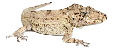
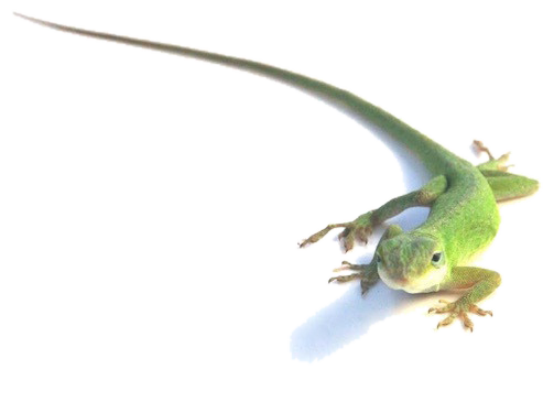
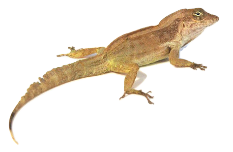
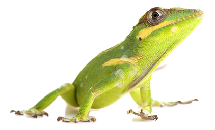
This plotting method is fairly flexible, as we've seen. We can also plot our tree in a circular or “fan” style. In the following demo, I will also show how to add raster images of some of the taxa to our plot, which is kind of cool.
It uses the following raster images:
plot(obj,type="fan",outline=FALSE,fsize=c(0.6,1),legend=1,
    lwd=c(4,8),xlim=c(-1.8,1.8),leg.txt="log(SVL)")
spp<-c("barbatus","porcatus","cristatellus","equestris","sagrei")
library(png)
w<-0.5
for(i in 1:length(spp)){
    xy<-add.arrow(obj,spp[i],col="transparent",arrl=0.45,lwd=3,hedl=0.1)
    arrl<-if(spp[i]%in%c("sagrei","porcatus")) 0.24
        else if(spp[i]=="barbatus") 0.2 else 0.34
    add.arrow(obj,spp[i],col="blue",arrl=arrl,lwd=3,hedl=0.05)
    img<-readPNG(source=paste(spp[i],".png",sep=""))
    asp<-dim(img)[1]/dim(img)[2]
    rasterImage(img,xy$x0-w/2,xy$y0-w/2*asp,xy$x0+w/2,xy$y0+w/2*asp)
}

dev.off()
## null device
##           1
Another popular visualization method in phytools is something called a phylomorphospace, which is just a projection of the tree into (normally) a two-dimensional morphospace. For example:
phylomorphospace(tree,X[,1:2],xlab="trait 1",ylab="trait 2")

For more than three continuous trait dimensions phytools also has a method that I really like, although I've literally never seen it used in publication. I call this method a 'phylogenetic scatterplot matrix' because it contains unidimensional contMap plots on the diagonal & bivariate phylomorphospaces for each pair of traits in off-diagonal positions. This is what that looks like for five traits:
obj<-fancyTree(tree,type="scattergram",X=X[,1:5])
## Computing multidimensional phylogenetic scatterplot matrix...

dev.off()
## null device
##           1
2. Methods for discrete characters
In addition to these continuous character methods, phytools also has a number of discrete character visualization tools for plotting discrete valued traits & trees.
For instance, phytools contains a range of different methods related to a statistical approach called stochastic character mapping, in which dicrete character histories are sampled from their posterior probability distribution.
In the following part of the exercise, I will map 'ecomorph' onto the tree of Anolis lizards, for which we will use the file ecomorph.csv.
ecomorph<-read.csv("ecomorph.csv",row.names=1)
ecomorph<-setNames(ecomorph[,1],rownames(ecomorph))
cols<-setNames(palette()[1:6],levels(ecomorph))
ecomorph.tree<-make.simmap(drop.tip(anole.tree,
    setdiff(anole.tree$tip.label,names(ecomorph))),ecomorph,
    model="ER")
## make.simmap is sampling character histories conditioned on the transition matrix
##
## Q =
##            CG         GB         TC         TG         Tr         Tw
## CG -0.6942418  0.1388484  0.1388484  0.1388484  0.1388484  0.1388484
## GB  0.1388484 -0.6942418  0.1388484  0.1388484  0.1388484  0.1388484
## TC  0.1388484  0.1388484 -0.6942418  0.1388484  0.1388484  0.1388484
## TG  0.1388484  0.1388484  0.1388484 -0.6942418  0.1388484  0.1388484
## Tr  0.1388484  0.1388484  0.1388484  0.1388484 -0.6942418  0.1388484
## Tw  0.1388484  0.1388484  0.1388484  0.1388484  0.1388484 -0.6942418
## (estimated using likelihood);
## and (mean) root node prior probabilities
## pi =
##        CG        GB        TC        TG        Tr        Tw
## 0.1666667 0.1666667 0.1666667 0.1666667 0.1666667 0.1666667
## Done.
plot(ecomorph.tree,cols,type="fan",fsize=0.8,lwd=3,ftype="i")
add.simmap.legend(colors=cols,x=0.9*par()$usr[1],
    y=0.9*par()$usr[4],prompt=FALSE,fsize=0.9)

Normally, we would be working with a set of stochastic character histories, not just a single such history. Here's an example in which we first do stochastic mapping, & then we plot the posterior probabilities that each node is in each state.
ecomorph.trees<-make.simmap(drop.tip(anole.tree,
    setdiff(anole.tree$tip.label,names(ecomorph))),ecomorph,
    model="ER",nsim=100)
## make.simmap is sampling character histories conditioned on the transition matrix
##
## Q =
##            CG         GB         TC         TG         Tr         Tw
## CG -0.6942418  0.1388484  0.1388484  0.1388484  0.1388484  0.1388484
## GB  0.1388484 -0.6942418  0.1388484  0.1388484  0.1388484  0.1388484
## TC  0.1388484  0.1388484 -0.6942418  0.1388484  0.1388484  0.1388484
## TG  0.1388484  0.1388484  0.1388484 -0.6942418  0.1388484  0.1388484
## Tr  0.1388484  0.1388484  0.1388484  0.1388484 -0.6942418  0.1388484
## Tw  0.1388484  0.1388484  0.1388484  0.1388484  0.1388484 -0.6942418
## (estimated using likelihood);
## and (mean) root node prior probabilities
## pi =
##        CG        GB        TC        TG        Tr        Tw
## 0.1666667 0.1666667 0.1666667 0.1666667 0.1666667 0.1666667
## Done.
obj<-summary(ecomorph.trees,plot=FALSE)
plot(obj,colors=cols,type="fan",fsize=0.8,cex=c(0.5,0.3))
add.simmap.legend(colors=cols,x=0.9*par()$usr[1],
    y=0.9*par()$usr[4],prompt=FALSE,fsize=0.9)

These are not visualizations for phylogenies, per se, but there are several other related plotting methods in the phytools that we can employ here. For instance, we can visualize our fitted discrete character model:
fit.ARD<-fitMk(ecomorph.tree,ecomorph,model="ARD")
plot(fit.ARD,main="fitted ARD model for ecomorph evolution")

plot(fit.ARD,show.zeros=FALSE,main="fitted ARD model for ecomorph evolution")

We can also visualize the posterior density of changes of different types on the tree. For example:
dd<-density(ecomorph.trees)
plot(dd)

For binary traits we have more options still. In this example we will use a different empirical dataset consisting of feeding mode (biting vs. suction feeding) in elomorph eels. The first plot is just the character distribution at the tips; whereas the second is the posterior density from stochastic mapping at the edges & nodes of the tree.
For this example I will use the following files that we have already seen:
eel.tree<-read.tree("elopomorph.tre")
eel.data<-read.csv("elopomorph.csv",row.names=1)
fmode<-as.factor(setNames(eel.data[,1],rownames(eel.data)))
dotTree(eel.tree,fmode,colors=setNames(c("blue","red"),
    c("suction","bite")),ftype="i",fsize=0.7)

eel.trees<-make.simmap(eel.tree,fmode,nsim=100)
## make.simmap is sampling character histories conditioned on the transition matrix
##
## Q =
##                bite     suction
## bite    -0.01582783  0.01582783
## suction  0.01582783 -0.01582783
## (estimated using likelihood);
## and (mean) root node prior probabilities
## pi =
##    bite suction
##     0.5     0.5
## Done.
obj<-densityMap(eel.trees,states=c("suction","bite"),plot=FALSE)
## sorry - this might take a while; please be patient
plot(obj,lwd=4,outline=TRUE,fsize=c(0.7,0.9),legend=50)

Or we can show the full posterior sample of changes of each type on the tree. These are not changes from any single stochastic character history, but changes in our full posterior sample of such histories.
dotTree(eel.tree,fmode,colors=setNames(c("red","blue"),c("bite","suction")),
    fsize=0.7,ftype="i",legend=FALSE)
add.simmap.legend(x=0,y=-4,colors=setNames(c("red","blue"),c("bite",
    "suction")),prompt=FALSE,vertical=FALSE,shape="circle")
nulo<-sapply(eel.trees,markChanges,sapply(setNames(c("red","blue"),
    c("bite","suction")),make.transparent,0.05))
add.simmap.legend(colors=sapply(setNames(setNames(c("red","blue"),
    c("bite","suction"))[2:1],
    c("bite->suction","suction->bite")),
    make.transparent,0.1),prompt=FALSE,x=50,y=-4,vertical=FALSE)

3. Methods combining discrete & continuous traits
In addition to these methods for either continuous or discretely measured character traits, we can easily combine the methods.
For instance, in the following I will overlay the posterior density from stochastic mapping on a dotTree plot of the continuous trait of overall body size.
bsize<-setNames(eel.data[,2],rownames(eel.data))
dotTree(eel.tree,bsize,length=10,fsize=0.7,lwd=7,ftype="i")
text(x=28,y=-1.8,"body size (cm)",pos=4)
plot(obj$tree,colors=obj$cols,add=TRUE,ftype="off",lwd=5,
    xlim=get("last_plot.phylo",envir=.PlotPhyloEnv)$x.lim,
    ylim=get("last_plot.phylo",envir=.PlotPhyloEnv)$y.lim)
add.color.bar(leg=50,cols=obj$cols,title="PP(state=bite)",
    prompt=FALSE,x=70,y=-2)

Alternatively, we could do this as two facing plots - one of densityMap and the other of contMap styles:
layout(matrix(1:3,1,3),widths=c(0.39,0.22,0.39))
plot(obj,lwd=6,ftype="off",legend=60,outline=TRUE,fsize=c(0,1.2))
plot.new()
plot.window(xlim=c(-0.1,0.1),
    ylim=get("last_plot.phylo",envir=.PlotPhyloEnv)$y.lim)
par(cex=0.6)
text(rep(0,length(obj$tree$tip.label)),1:Ntip(obj$tree),
    gsub("_"," ",obj$tree$tip.label),font=3)
plot(setMap(contMap(eel.tree,bsize,plot=FALSE),invert=TRUE),lwd=6,outline=TRUE,
    direction="leftwards",ftype="off",legend=60,fsize=c(0,1.2),
    leg.txt="body size (cm)")

As another example here is a stochastically mapped discrete character history overlain on a traitgram plot of body size. At nodes I will add the posterior probabilties from stochastic mapping.
phenogram(eel.trees[[1]],bsize,lwd=3,colors=
    setNames(c("blue","red"),c("suction","bite")),
    spread.labels=TRUE,spread.cost=c(1,0),fsize=0.6,
    ftype="i")
## Optimizing the positions of the tip labels...
##         1         2         3         4         5         6         7
##  15.00000  18.91667 112.91667  38.50000 156.00000 222.58333  62.00000
##         8         9        10        11        12        13        14
## 179.50000 214.75000 124.66667 195.16667  22.83333  65.91667  93.33333
##        15        16        17        18        19        20        21
##  34.58333  97.25000 120.75000 105.08333  69.83333 140.33333 218.66667
##        22        23        24        25        26        27        28
##  58.08333  50.25000 238.25000 206.91667 159.91667 199.08333  85.50000
##        29        30        31        32        33        34        35
## 152.08333 136.41667 109.00000 163.83333 175.58333 171.66667  46.33333
##        36        37        38        39        40        41        42
## 128.58333  77.66667 234.33333 203.00000 132.50000 191.25000  81.58333
##        43        44        45        46        47        48        49
## 144.25000 246.08333  26.75000 183.41667 250.00000 226.50000 242.16667
##        50        51        52        53        54        55        56
## 230.41667  73.75000  54.16667  30.66667  89.41667  42.41667 116.83333
##        57        58        59        60        61
## 101.16667 187.33333 148.16667 210.83333 167.75000
add.simmap.legend(colors=setNames(c("blue","red"),c("suction","bite")),
    prompt=FALSE,shape="circle",x=0,y=250)
obj<-summary(eel.trees)
nodelabels(pie=obj$ace,piecol=setNames(c("red","blue"),colnames(obj$ace)),
    cex=0.6)
tiplabels(pie=to.matrix(fmode[eel.tree$tip.label],colnames(obj$ace)),
    piecol=setNames(c("red","blue"),colnames(obj$ace)),cex=0.4)

These are just a few examples. There are many other ways in which discrete & continuous character methods can be combined.
4. Other methods
I'm now going to demonstrate a handful of other phytools plotting methods.
Firstly, phytools can be used to project a tree onto a geographic map. This can be done using linking lines from the tips of a square phylogram or directly.
For this example, you will need the following file:
lat.long<-read.csv("latlong.csv",row.names=1)
obj<-phylo.to.map(tree,lat.long,plot=FALSE)
## objective: 110
## objective: 110
## objective: 110
## objective: 110
## objective: 110
## objective: 110
## objective: 110
## objective: 110
## objective: 100
## objective: 100
## objective: 98
## objective: 98
## objective: 98
## objective: 98
## objective: 98
## objective: 98
## objective: 96
## objective: 92
## objective: 92
## objective: 86
## objective: 86
## objective: 86
## objective: 86
## objective: 86
## objective: 86
plot(obj,type="phylogram",asp=1.3,mar=c(0.1,0.5,3.1,0.1))

plot(obj,type="direct",asp=1.3,mar=c(0.1,0.5,3.1,0.1))

dev.off()
## null device
##           1
phytools can be used to create a co-phylogenetic plot in which two trees are graphed in a facing fashion, with linking lines between corresponding tips. The following uses data from Lopez-Vaamonde et al. (2001; MPE):
trees<-read.tree("cophylo.tre")
Pleistodontes<-trees[[1]]
Sycoscapter<-trees[[2]]
assoc<-read.csv("assoc.csv")
obj<-cophylo(Pleistodontes,Sycoscapter,assoc=assoc,
    print=TRUE)
## Rotating nodes to optimize matching...
## objective: 359.577777777778
## objective: 359.577777777778
## objective: 359.577777777778
## objective: 359.577777777778
## objective: 359.577777777778
## objective: 359.577777777778
## objective: 359.577777777778
## objective: 359.577777777778
## objective: 359.577777777778
## objective: 359.577777777778
## objective: 359.577777777778
## objective: 359.577777777778
## objective: 357.777777777778
## objective: 357.777777777778
## objective: 345.111111111111
## objective: 345.111111111111
## objective: 345.111111111111
## objective: 322.777777777778
## objective: 201.17728531856
## objective: 201.17728531856
## objective: 201.17728531856
## objective: 201.17728531856
## objective: 201.17728531856
## objective: 201.17728531856
## objective: 201.17728531856
## objective: 201.17728531856
## objective: 201.17728531856
## objective: 201.17728531856
## objective: 201.17728531856
## objective: 201.17728531856
## objective: 201.17728531856
## objective: 201.17728531856
## objective: 322.777777777778
## objective: 322.777777777778
## objective: 322.777777777778
## objective: 322.777777777778
## objective: 322.777777777778
## objective: 322.777777777778
## objective: 322.777777777778
## objective: 322.777777777778
## objective: 322.777777777778
## objective: 322.777777777778
## objective: 322.777777777778
## objective: 322.777777777778
## objective: 322.777777777778
## objective: 322.777777777778
## objective: 322.777777777778
## objective: 322.777777777778
## objective: 322.777777777778
## objective: 322.777777777778
## objective: 201.17728531856
## objective: 201.17728531856
## objective: 201.17728531856
## objective: 201.17728531856
## objective: 201.17728531856
## objective: 201.17728531856
## objective: 201.17728531856
## objective: 201.17728531856
## objective: 201.17728531856
## objective: 201.17728531856
## objective: 201.17728531856
## objective: 201.17728531856
## objective: 201.17728531856
## objective: 201.17728531856
## Done.
plot(obj,link.type="curved",link.lwd=3,link.lty="solid",
    link.col=make.transparent("blue",0.25),fsize=0.8)

This method is fairly flexible. For instance, we can use add tip, node, or edge labels to each tree, or we can us different colors for different edges.
plot(obj,link.type="curved",link.lwd=3,link.lty="solid",
    link.col="grey",fsize=0.8)
nodelabels.cophylo(which="left",frame="circle",cex=0.8)
nodelabels.cophylo(which="right",frame="circle",cex=0.8)

left<-rep("black",nrow(obj$trees[[1]]$edge))
nodes<-getDescendants(obj$trees[[1]],30)
left[sapply(nodes,function(x,y) which(y==x),y=obj$trees[[1]]$edge[,2])]<-
    "blue"
right<-rep("black",nrow(obj$trees[[2]]$edge))
nodes<-getDescendants(obj$trees[[2]],25)
right[sapply(nodes,function(x,y) which(y==x),y=obj$trees[[2]]$edge[,2])]<-
    "blue"
edge.col<-list(left=left,right=right)
plot(obj,link.type="curved",link.lwd=3,link.lty="solid",
    link.col=make.transparent("blue",0.25),fsize=0.8,
    edge.col=edge.col)

phytools contains a method for plotting a posterior sample of trees from Bayesian analysis. This is more or less equivalent to the stand-alone program densiTree. Here's a demo:
trees<-read.tree("density.tre")
densityTree(trees,type="cladogram",nodes="intermediate")

We can also just represent topological incongruence among trees:
densityTree(trees,use.edge.length=FALSE,type="phylogram",nodes="inner")

If we want to just compare two alternative time trees for the same set of taxa, we could try compare.chronograms. Here is a demo with simulated trees.
tree<-rtree(n=26,tip.label=LETTERS)
t1<-force.ultrametric(tree,"nnls")
tree$edge.length<-runif(n=nrow(tree$edge))
t2<-force.ultrametric(tree,"nnls")
compare.chronograms(t1,t2)

phytools has an interactive node labeling method. Here's a demo using a phylogeny of vertebrates (in non-interactive mode), using the following file:
vertebrates<-read.tree("vertebrates.tre")
plotTree(vertebrates,xlim=c(-24,450))
labels<-c("Cartilaginous fish",
    "Ray-finned fish",
    "Lobe-finned fish",
    "Anurans",
    "Reptiles (& birds)",
    "Birds",
    "Mammals",
    "Eutherians")
nodes<-labelnodes(text=labels,node=c(24,27,29,32,34,35,37,40),
    shape="ellipse",cex=0.8,interactive=FALSE)

Another method in phytools allows us to easily label only a subset of tips in the tree. This can be handy for very large trees in which we are only interested in labeling a handful of taxa.
plot(ecomorph.tree,cols,xlim=c(0,1.2),ylim=c(-4,Ntip(ecomorph.tree)),ftype="off")
add.simmap.legend(colors=cols,prompt=FALSE,x=0,y=-4,vertical=FALSE)
text<-sample(ecomorph.tree$tip.label,20)
tips<-sapply(text,function(x,y) which(y==x),y=ecomorph.tree$tip.label)
linklabels(text,tips,link.type="curved")

Here is a recent method for adding circular clade labels to a plotted fan style tree.
obj<-setMap(contMap(anole.tree,svl,plot=FALSE),invert=TRUE)
plot(obj,type="fan",ftype="off",lwd=c(2,6),outline=FALSE,xlim=c(-1.3,1.3),
    legend=0.8,leg.txt="log(SVL)")
nodes<-c(105,117,122,135,165,169,68,172,176,183,184)
labels<-paste("Clade",LETTERS[1:length(nodes)])
for(i in 1:length(nodes))
    arc.cladelabels(tree=obj$tree,labels[i],nodes[i],
        orientation=if(labels[i]%in%c("Clade G","Clade J"))
        "horizontal" else "curved",mark.node=FALSE)

Finally, the following is a method to add a geological timescale to a plotted tree.
tree<-pbtree(b=0.03,d=0.01,n=200)
h<-max(nodeHeights(tree))
plotTree(tree,plot=FALSE)
obj<-geo.legend(alpha=0.3,cex=1.2,plot=FALSE)
obj$leg<-h-obj$leg
plotTree(tree,ftype="off",ylim=c(-0.2*Ntip(tree),Ntip(tree)),lwd=1)
geo.legend(leg=obj$leg,colors=obj$colors,cex=1.2)

5. Workshop logo
Finally, as has become the tradition for this course - we have a t-shirt to reveal, but (as is also the tradition), the design was built entirely in R as follows:
library(phangorn)
set.seed(63)
t1<-rtree(n=12,tip.label=LETTERS[1:12])
t2<-rSPR(t1,3)
obj<-cophylo(t1,t2,rotate=TRUE)
## Rotating nodes to optimize matching...
## Done.
T1<-obj$trees[[1]]$tip.label[1]
T2<-obj$trees[[2]]$tip.label[Ntip(t2)]
h1<-max(nodeHeights(t1))
h2<-max(nodeHeights(t2))
layout(matrix(c(1,2,3),3,1),height=c(0.2,0.7,0.1))
par(mar=rep(0,4))
plot.new()
plot.window(xlim=c(0,1),ylim=c(0,1))
text(0.5,0.5,"Latin American\nMacroevolution in        Workshop",col="#1F65B7FF",cex=3.5)
library(png)
img<-readPNG(source="rlogo.png")
xy<-c(0.597,0.3)
w<-0.17
asp<-dim(img)[1]/dim(img)[2]*par()$fin[1]/par()$fin[2]
rasterImage(img,xy[1]-w/2,xy[2]-w/2*asp,xy[1]+w/2,xy[2]+w/2*asp)
col<-"#AEAFB4"
par(fg="#AEAFB4")
plot(obj,lwd=5,link.lty="solid",link.lwd=5,
    link.col=col,ftype="off",link.type="curved",
    edge.col=list(left=rep("#AEAFB4",nrow(t1$edge)),
    right=rep("#AEAFB4",nrow(t2$edge))),part=0.36)
tiplabels.cophylo(pie=as.matrix(rep(1,Ntip(t1))),piecol="#1F65B7FF",cex=0.6)
tiplabels.cophylo(pie=as.matrix(rep(1,Ntip(t2))),piecol="#1F65B7FF",cex=0.6,
    which="right")
plot.new()
plot.window(xlim=c(0,1),ylim=c(0,1))
text(0.5,0.5,"Mexico City, 26-29 June 2018",col="#1F65B7FF",cex=2.5)

That's it!
Written by Liam J. Revell. Last updated 29 July 2018.